Background
User Flow
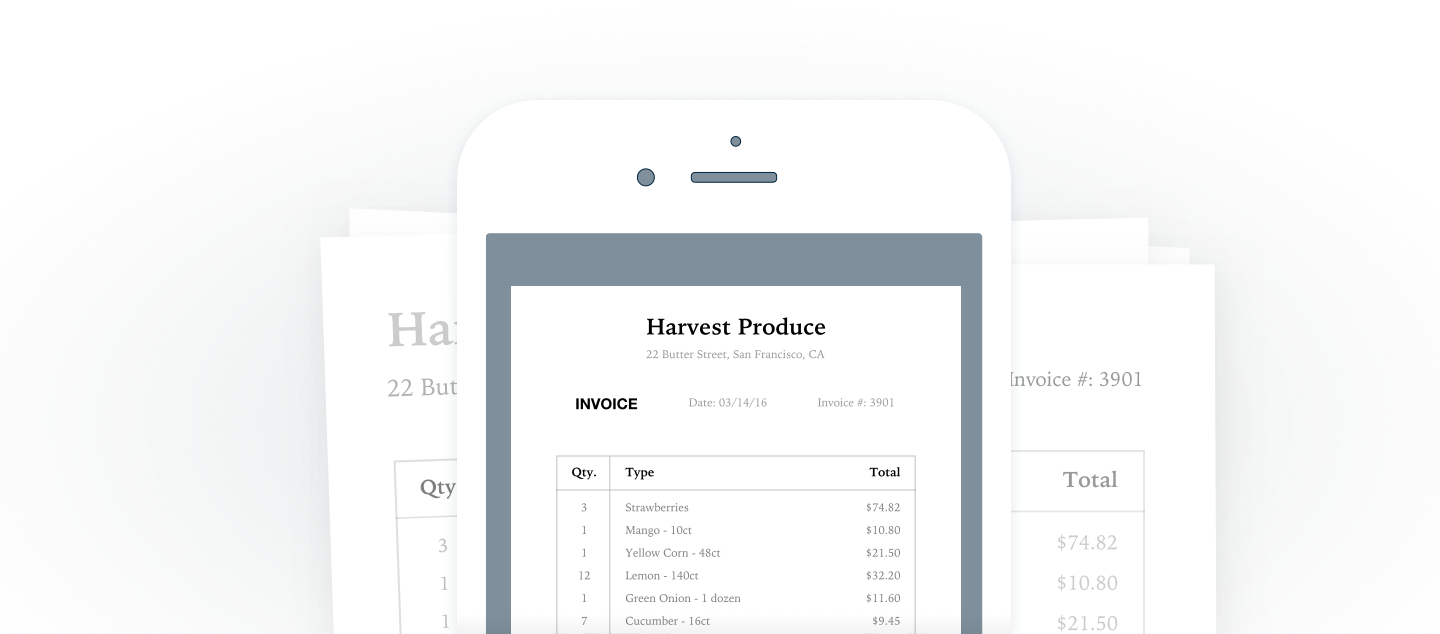
- Customers would scan, photograph, or email us invoices. We would then digitize them with OCR technology combined with manual data entry, and auto-mapped each line item to their GL codes (accounting speak).
- Based on the last price a restaurant paid for an item, they could track real-time food costs by category, item, and recipe.
- We integrated with most major accounting software, and allowed customers to pay all of their bills with just a few clicks.

These were just a few of our awesome customers in SF, whom we spoke with and whose restaurants we often visited during non busy hours to get feedback.

The scope of work I did in a year at Plate IQ dwarfs the time I have to dig through old stuff and document here, but there is quite a bit that I hope represents the breadth and quantity of problems I had to work on.
Unifying Components
As a designer and developer, I was responsible for building all of my designs.

However, the UI (and CSS) needed much cleanup when I joined. The front end was a Frankenstein of:
- Angular Material (component framework and some styles)
- Bootstrap (grid system and UI components)
- HTML5 components
- Font Awesome (font icons)
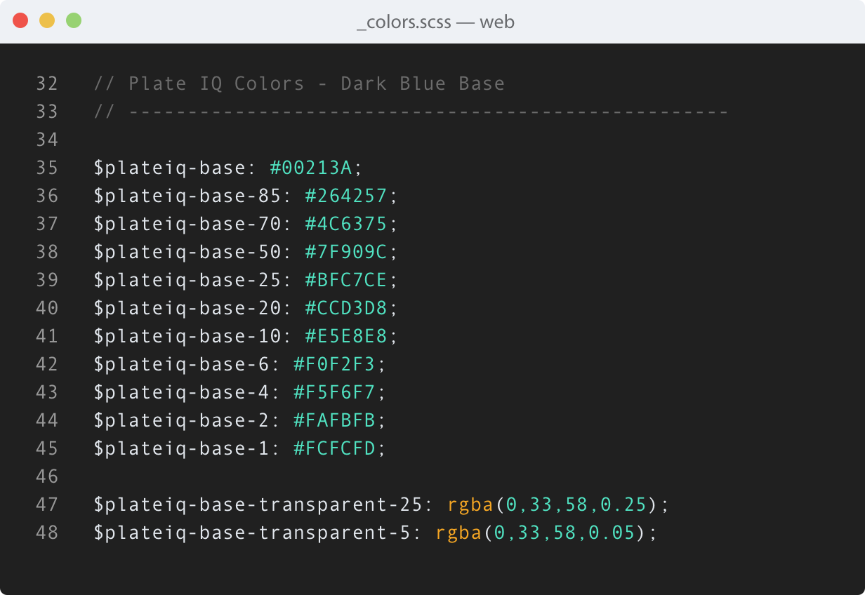
To make the overall Plate IQ UX more consistent, and also to make implementation of any new designs easier, I made standard variables for colors and used a color system and style guide to apply to components.
Example components before:
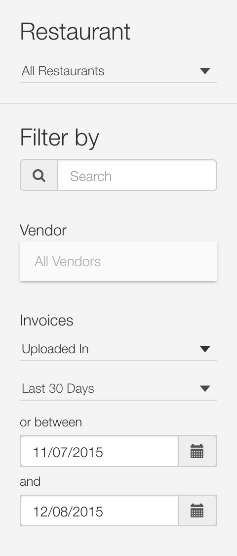
Example components after:
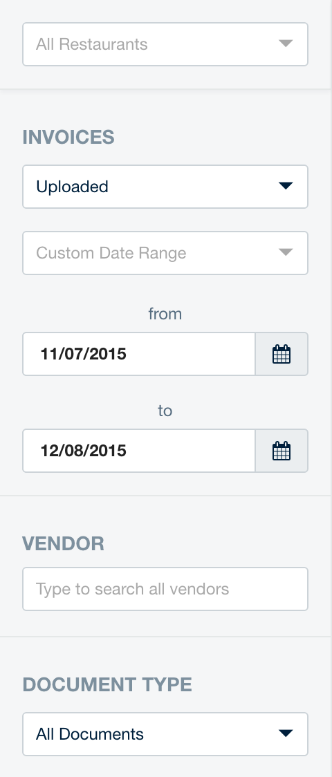
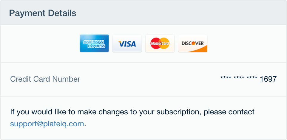
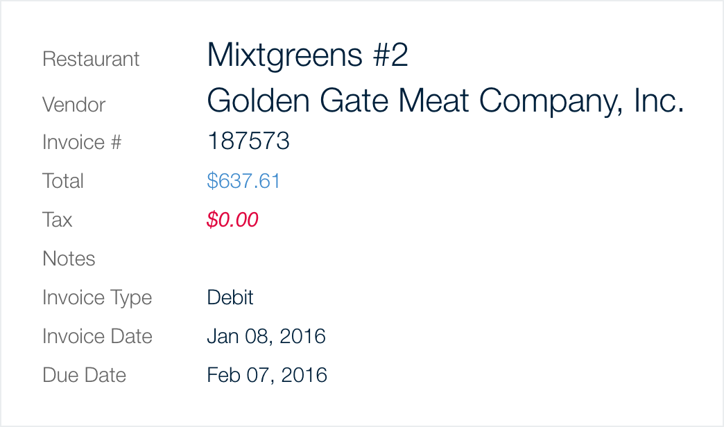
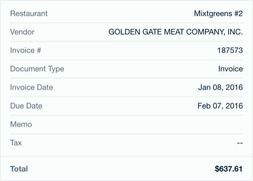
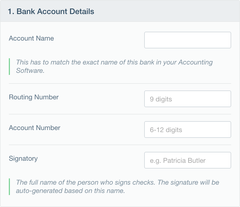
As I was cleaning up pages, I noticed a lot of Plate IQ information was stored as key-value pairs. To better handle this, I created a modular, panel-like component for the kind of information that was just like a table, but didn't always make sense to be in a table. Here are a few examples of its flexibility.
Before:

After:
Before:
After:
Before:
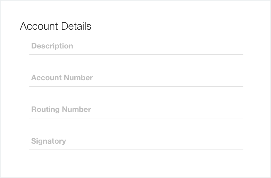
After:
Product Cleanup Continued
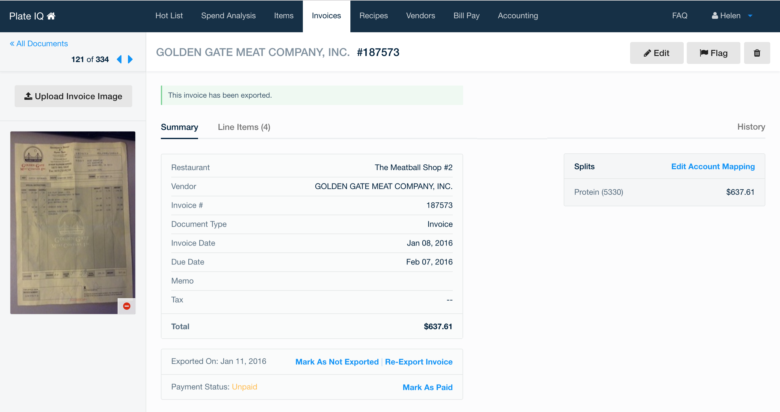
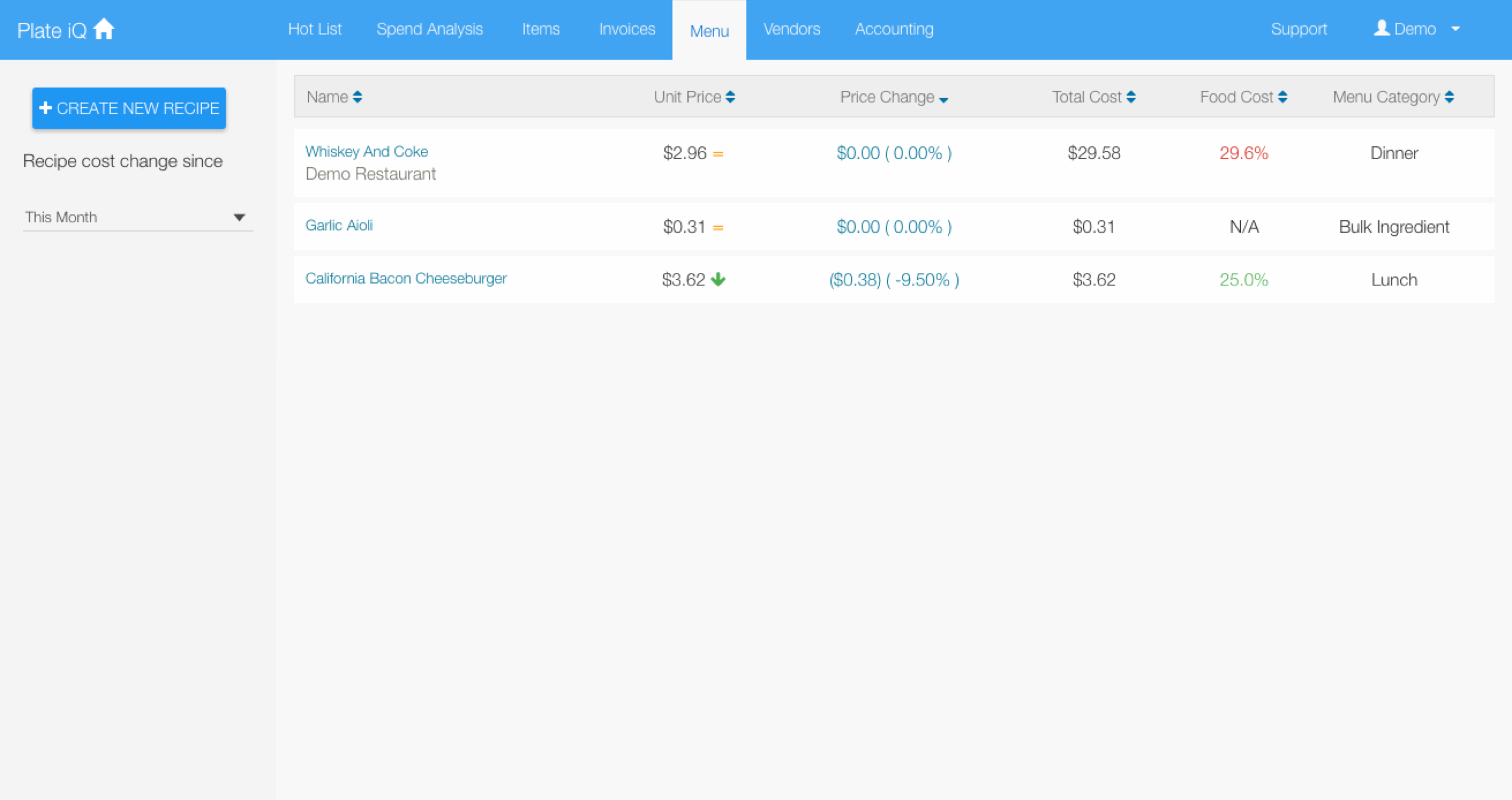
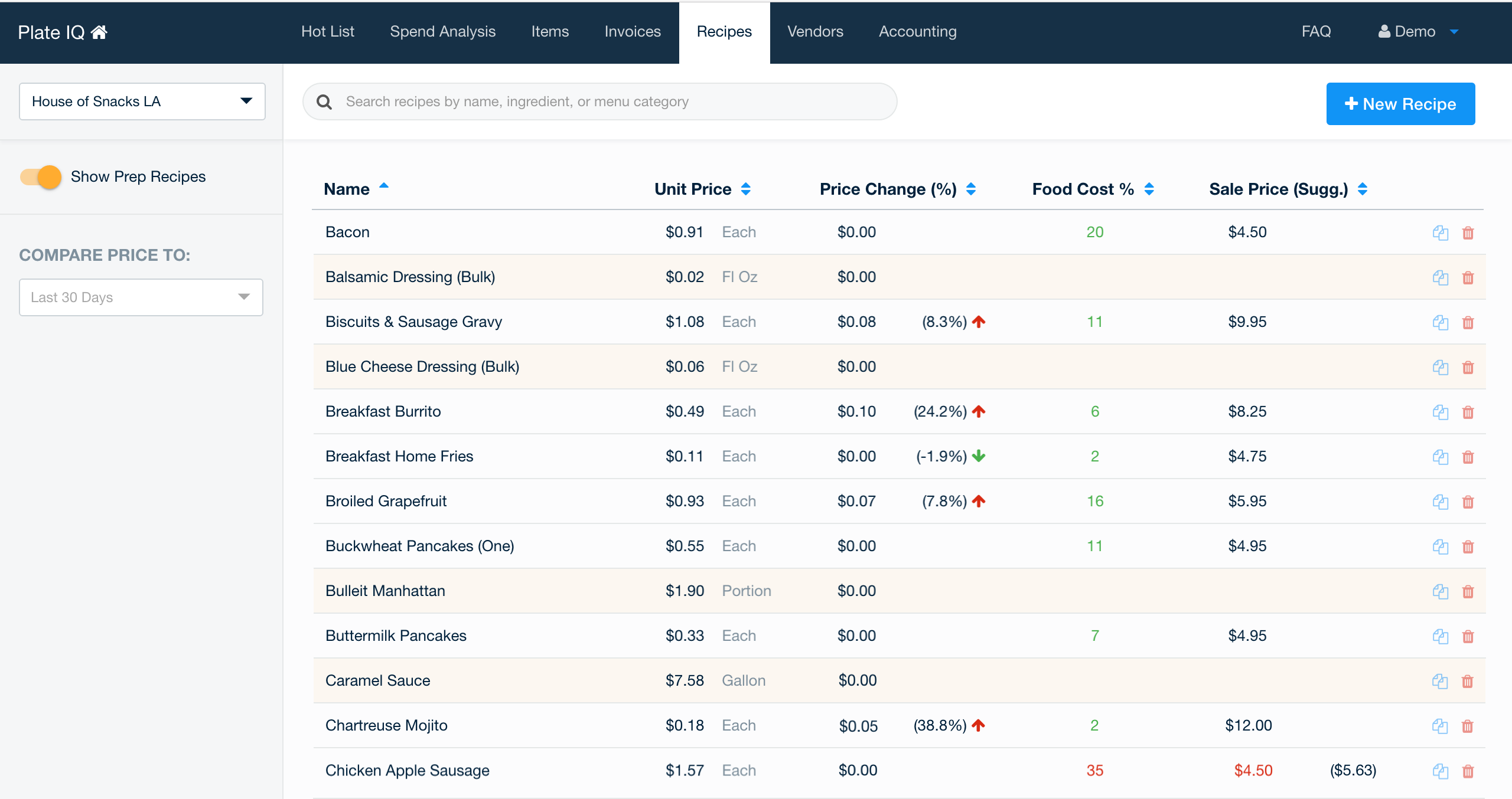
I also unified the global layout between different sections of the app.
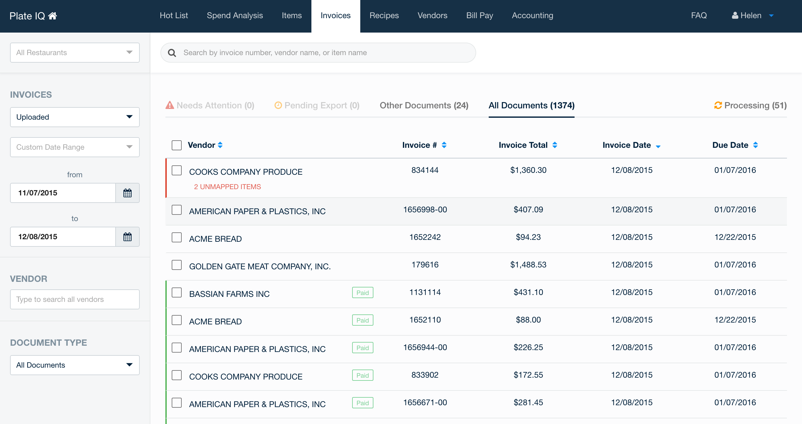
Enhancements you can see in the following before/after comparisons include placing the search input for a section in the same location when applicable, anchoring action items to the top right of a page, using color with intent, and increasing overall contrast, scannability, and readability of data.
After these changes rolled out, one of our customers called it a Rolls Royce, which was pretty awesome. However, he quickly followed up with "...except you haven't put any gas in it" referring to other features he wanted at the time, haha. You can't win 'em all :)
Invoice List: Before
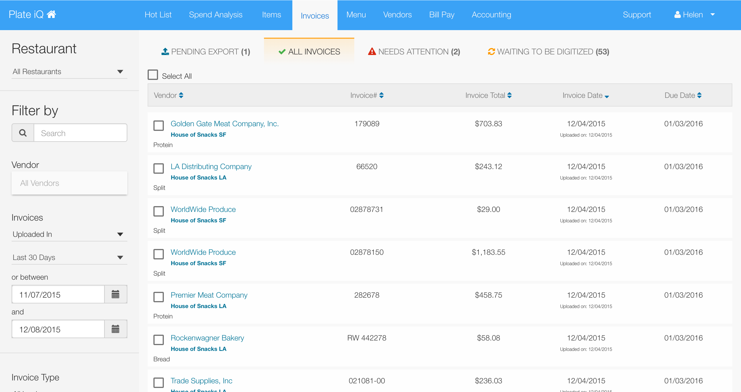
Invoice List: After
Invoice View: Before
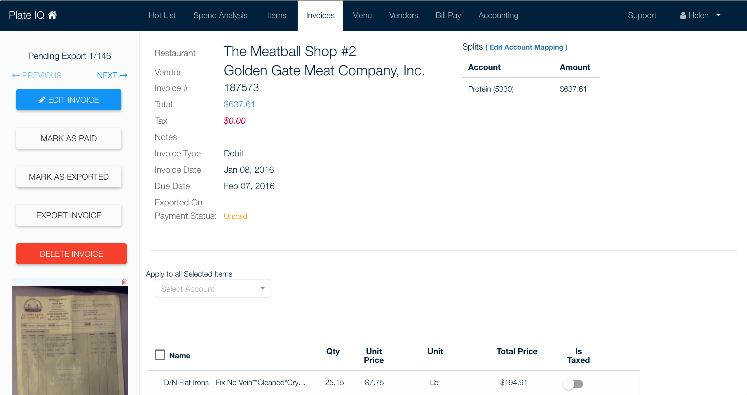
Invoice List: After
Recipe List: Before
Recipe List: After
Recipe Editor: Before
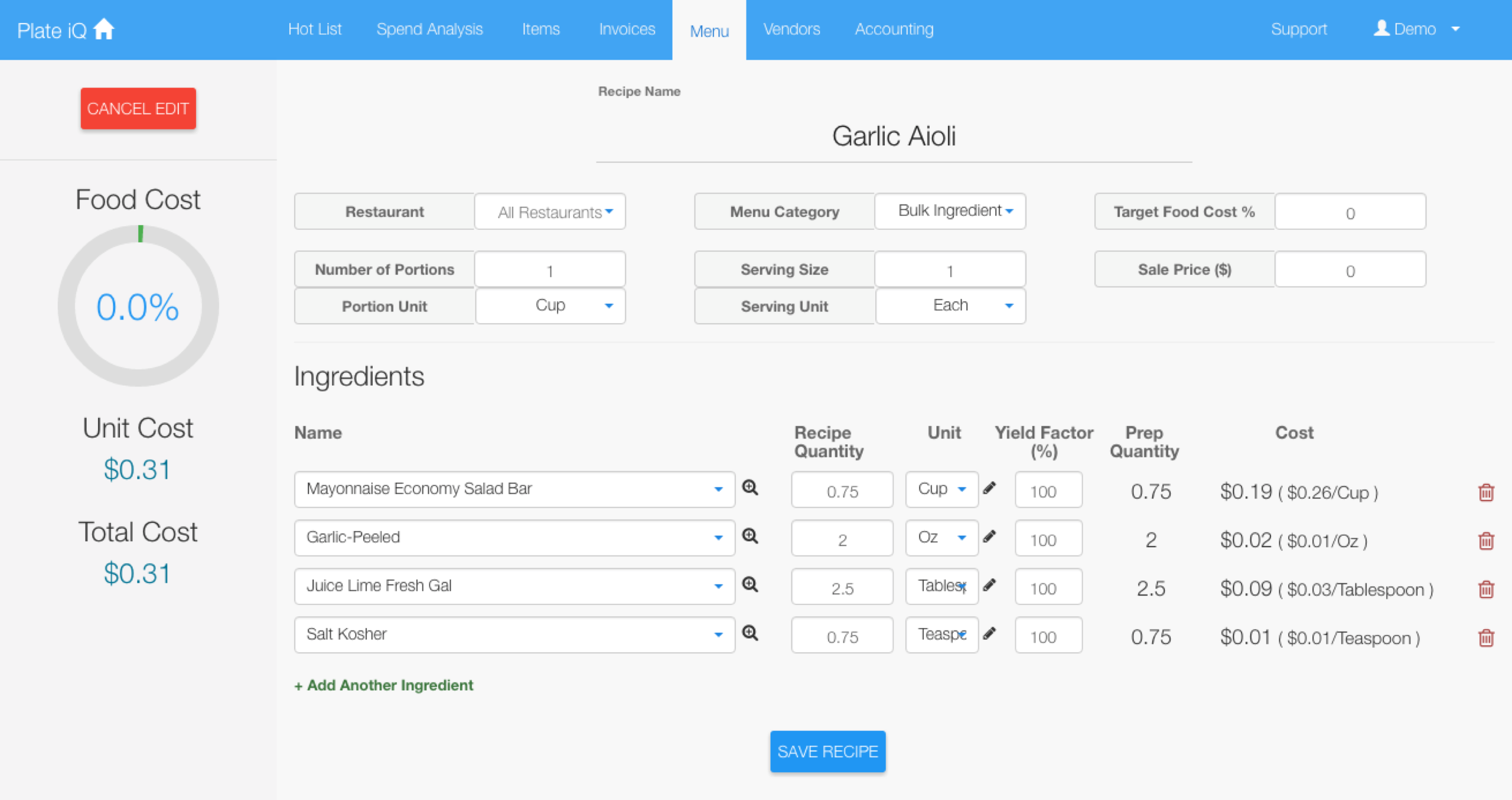
Recipe Editor: After
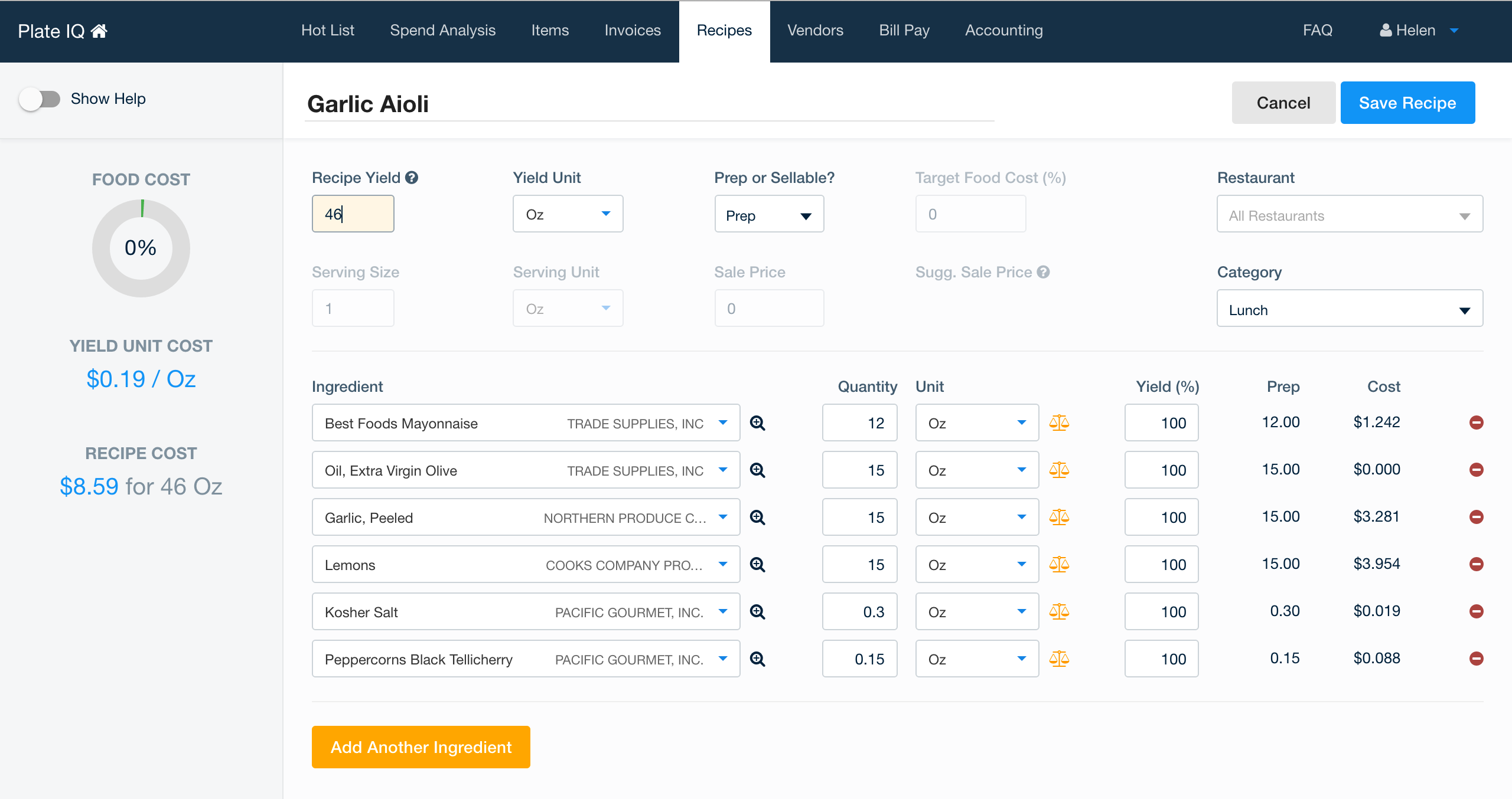
Recipes and Units
One of Plate IQ's features was a recipe creator that did automatic menu costing by pulling in an ingredient's cost from the last invoice and vendor from which you purchased it.
However, if your recipe used an item measured in quantities that were different from what you ordered it in, Plate IQ would need to know the unit conversion.
For example, a recipe for mashed potatoes uses potatoes by the Pound. However, you last ordered potatoes for $21.20 by the Case. To determine what potatoes contribute to the overall recipe cost, we need to know how many pounds are in a case.
In the example below, potatoes were ordered by the Case AND Bag, so the question is asked twice. This often happened with items, because resturants typically order things from multiple vendors depending on the season and what's available.
Unit Conversion: Before
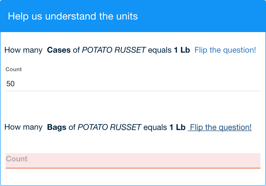
Sometimes, users were confused for items like fennel and cilantro, which come by non-standard units like bulb or bunch. If a recipe used 1 bulb of fennel, our popup would ask: "How many Each of FENNEL equals 1 Bulb?" but we really wanted to know "1 Each = ____ Bulb". The answer for this case is 1.
When confused users converted the item unit incorrectly or left it blank, all of their recipe prices using that item were incorrect or incomplete.
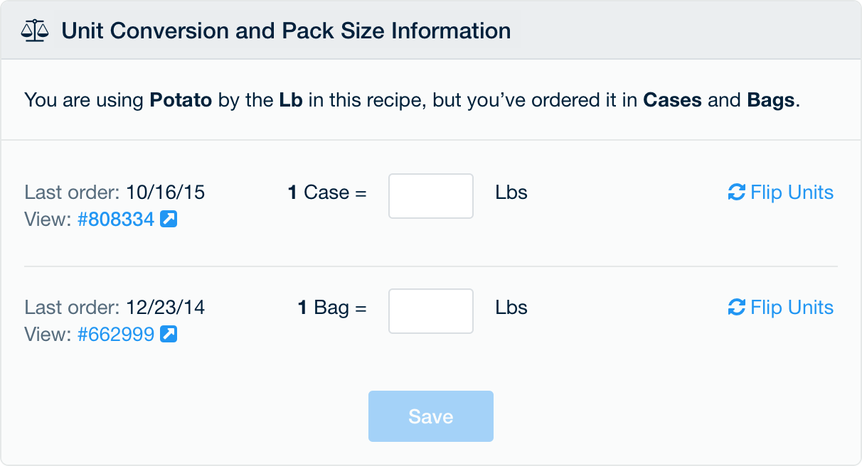
After gathering feedback from users, our CTO, and a data entry team member I made the following changes:
- Added a link to the last invoice you ordered that item with the unit in question
- Aligned the units and quantities vertically
- Changed copy from "flip question" to "flip units" to make it more clear
Unit Conversion: After
Inventory
This feature allowed restaurants to count items via an iOS app, which was an activity normally done by hand with Excel sheets printed on paper and marked up with a pencil and clipboard.
Onboarding was done on the web.

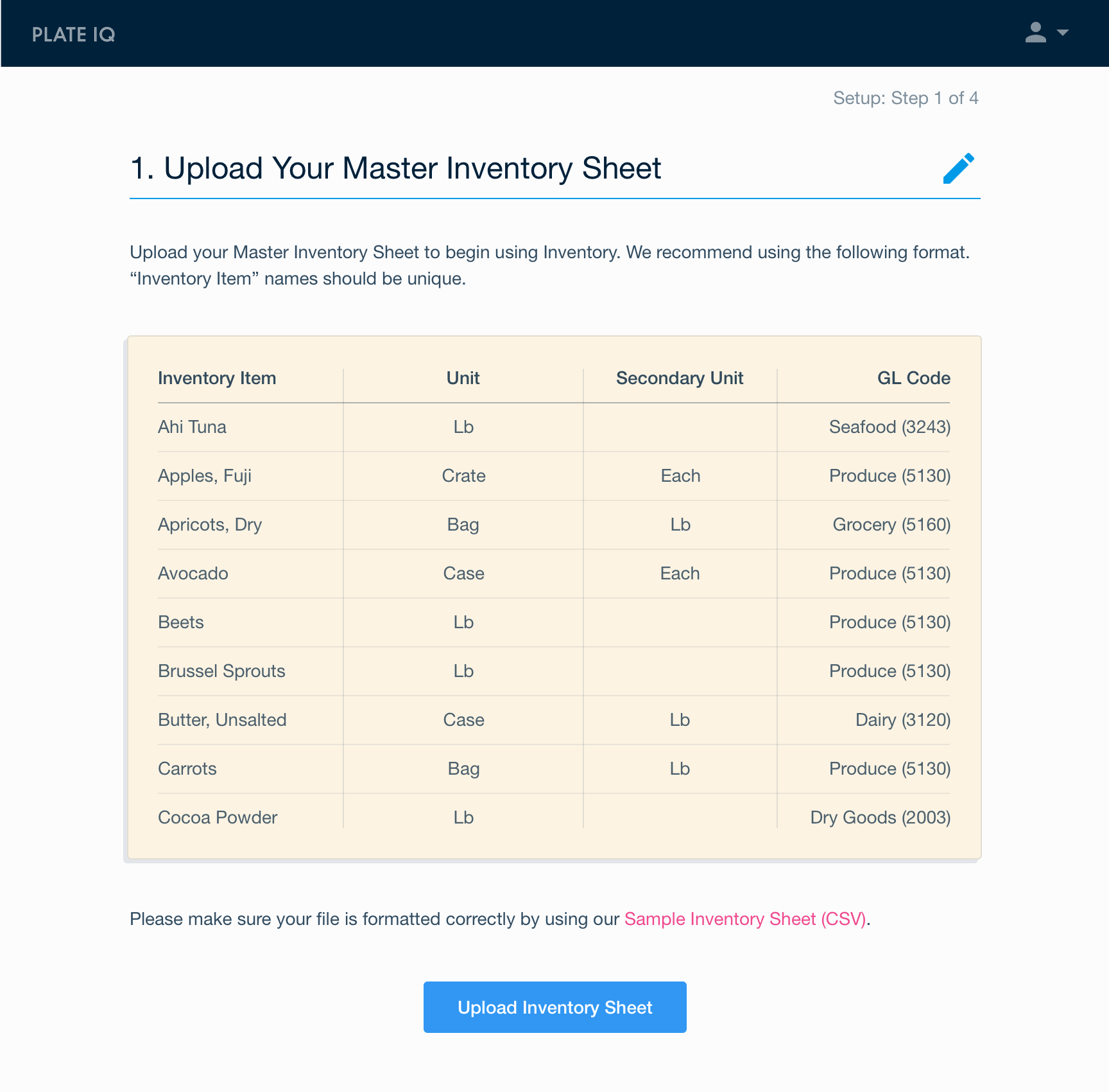
First, we began by asking users to upload their items with the unit(s) they choose to inventory those items in (which might be different from how they order the item), and the accounting GL code they wanted the item mapped to.
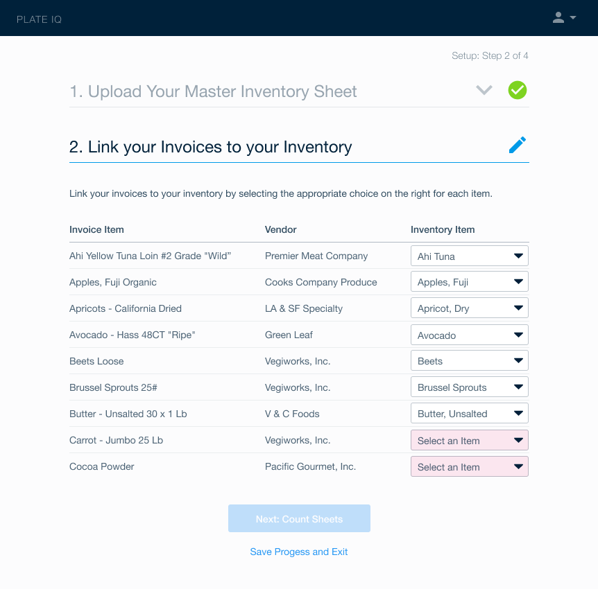
Then, we asked them to link the items we had in our system from digitized invoices to their inventory.
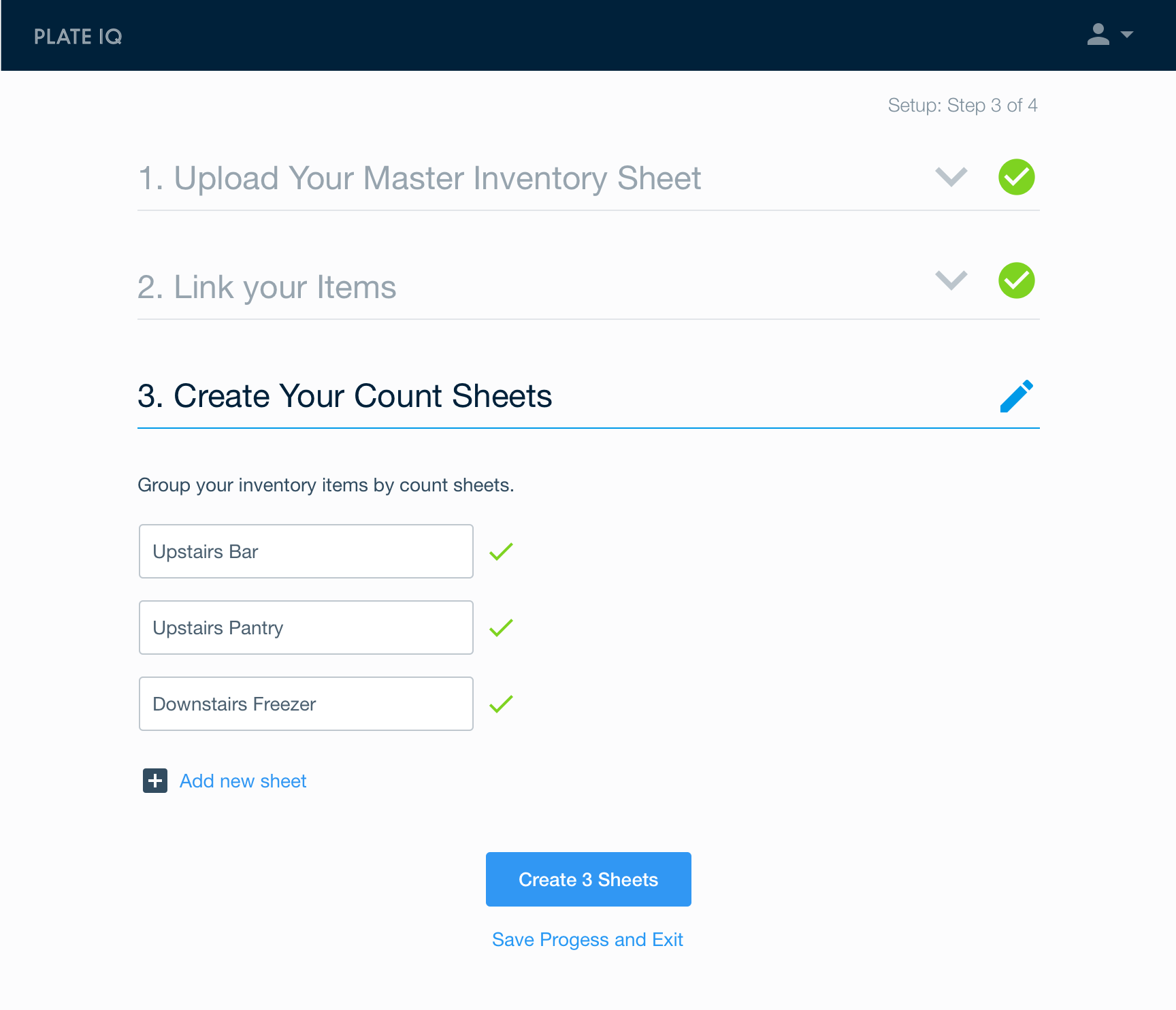
Next, we had users enter all the "areas" or count sheets where they might inventory items. Smaller restaurants often only had one, but multiple count sheets came as a request from our bigger customers.
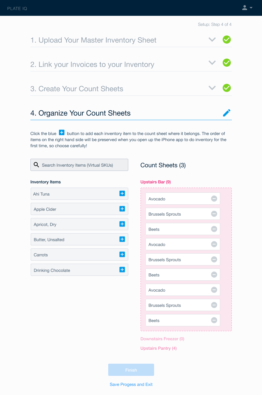
Lastly, we had users organize their items by count sheet.
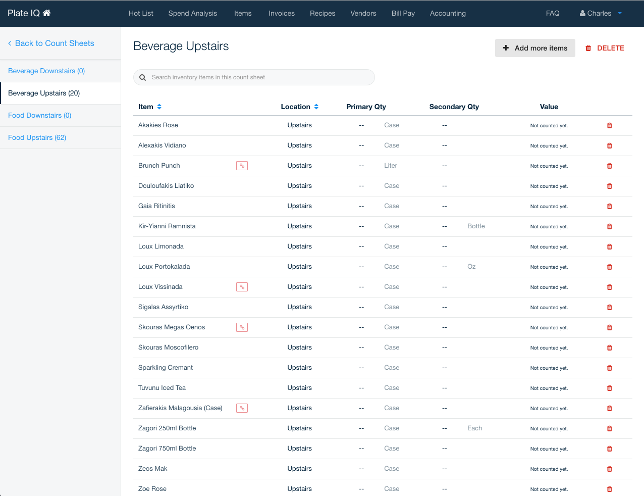
After someone set up their count sheet, it would look something like this in Plate IQ:
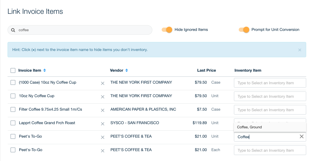
 However, as new items came in, Plate IQ would need to know which ones you cared to inventory, so I designed a workflow for that.
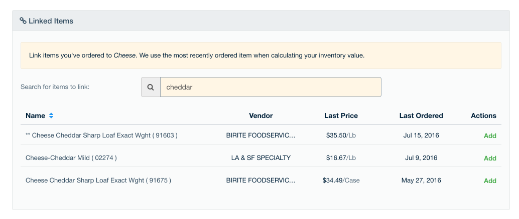
 On an individual item, you could see what was linked.
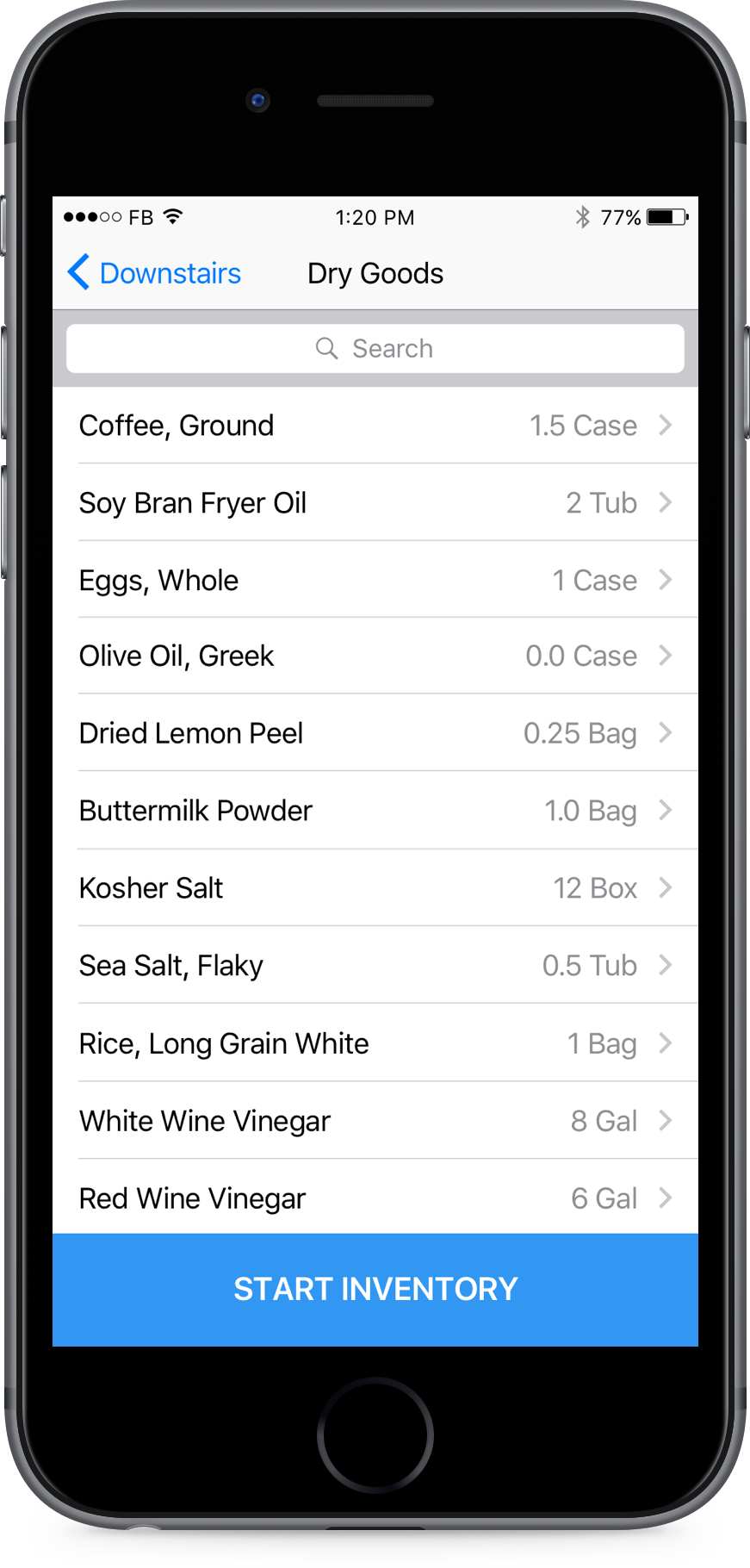
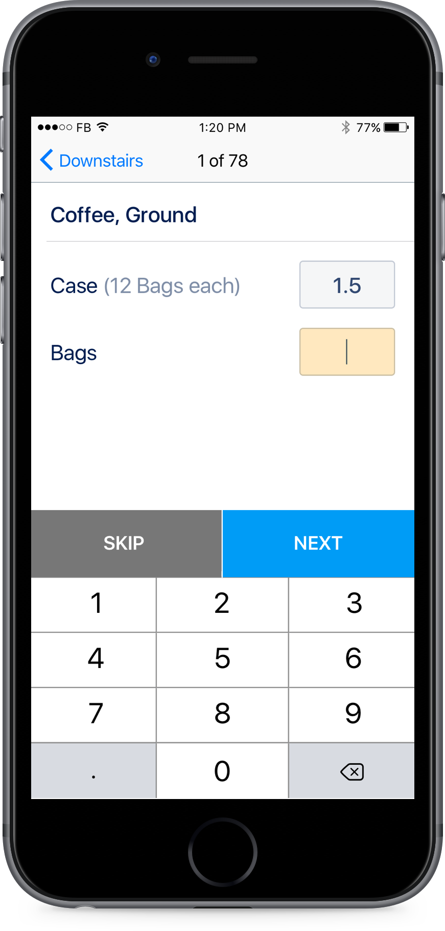
The iOS app for counting items was simple, and our goal was to be just as fast as pencil and paper so that adoption wouldn't be difficult. Some screen shots are below. Each item had a quantity and users could add one or multiple units in which to count it. Values were saved locally, and synced when devices had wifi access.

Miscellaneous work
Item and Pack Size Review
I worked on a UI for restaurants to review the information for the thousands of items they order per month.
Most of the time, Plate IQ's OCR correctly populated the fields, but sometimes users had to manually edit fields like category, unit, and pack size.
Item Review Card
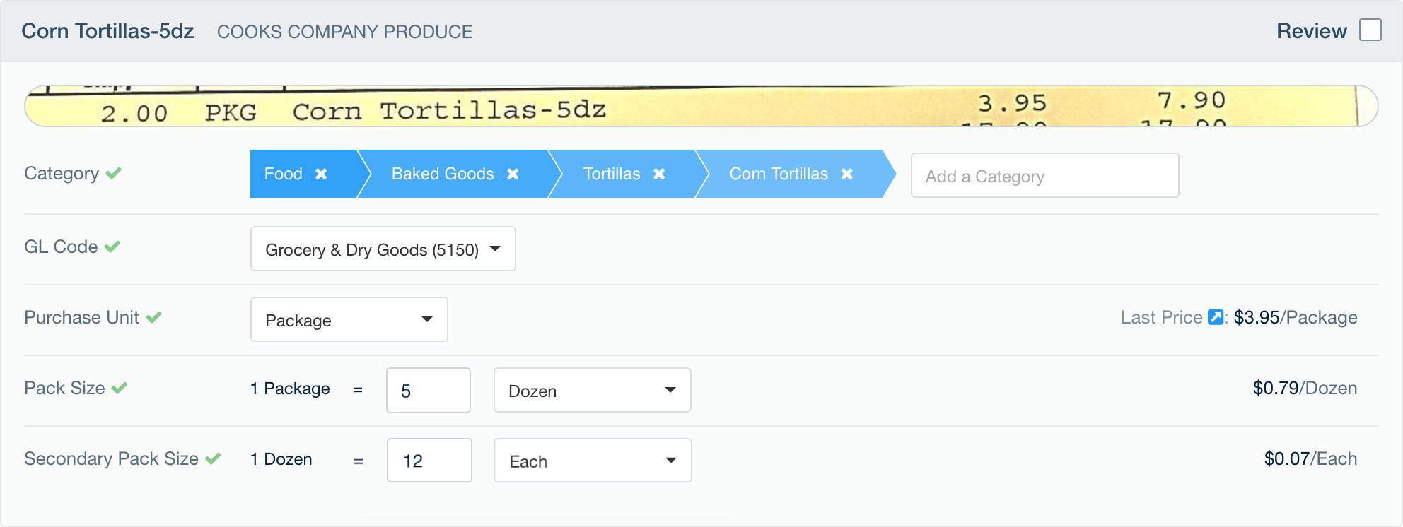
Letting users review and change an item's pack size was important, because this price per unit would later be used to calculate an item's value in both recipes and inventory.
Bill Pay
Now that we had restaurants' invoices, we needed to create a UI for them to pay their bills.
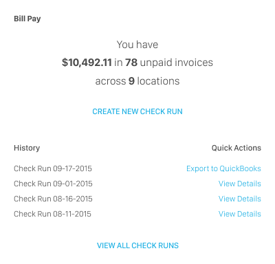
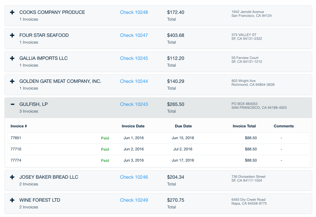
Most restaurants cut one check with the total due for multiple invoices. In accounting terms, this is called a check run. Here's an early wireframe of the concept.
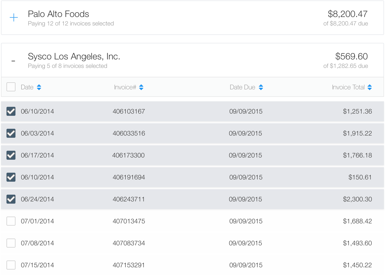
Sometimes, restaurants don't want to pay everything at once, so we showed them all invoices due per vendor, and allowed them to uncheck the ones they didn't want to pay.
Here's early dev work for creating a new check run:
Although I don't have screenshots for everything, there was an approval process for submitting check runs as well.
Later on, we realized that customers needed to know the address where checks were getting mailed to, so each vendor group header started looking like this, with an editable address field on the right:
New Vendor Workflow
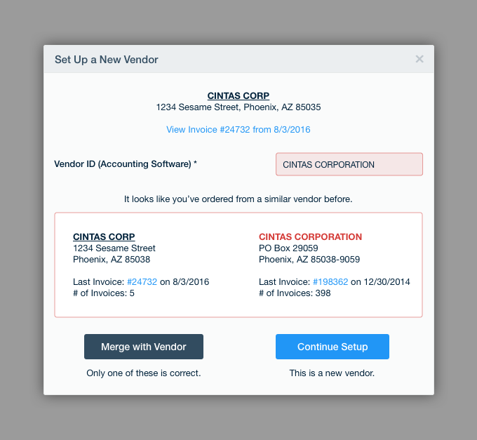
Setting up vendors and mapping them to GL codes in Plate IQ is also a workflow I worked on. Here is one step of a flow where a user had to merge two existing vendors.
Visualizing menu breakdowns
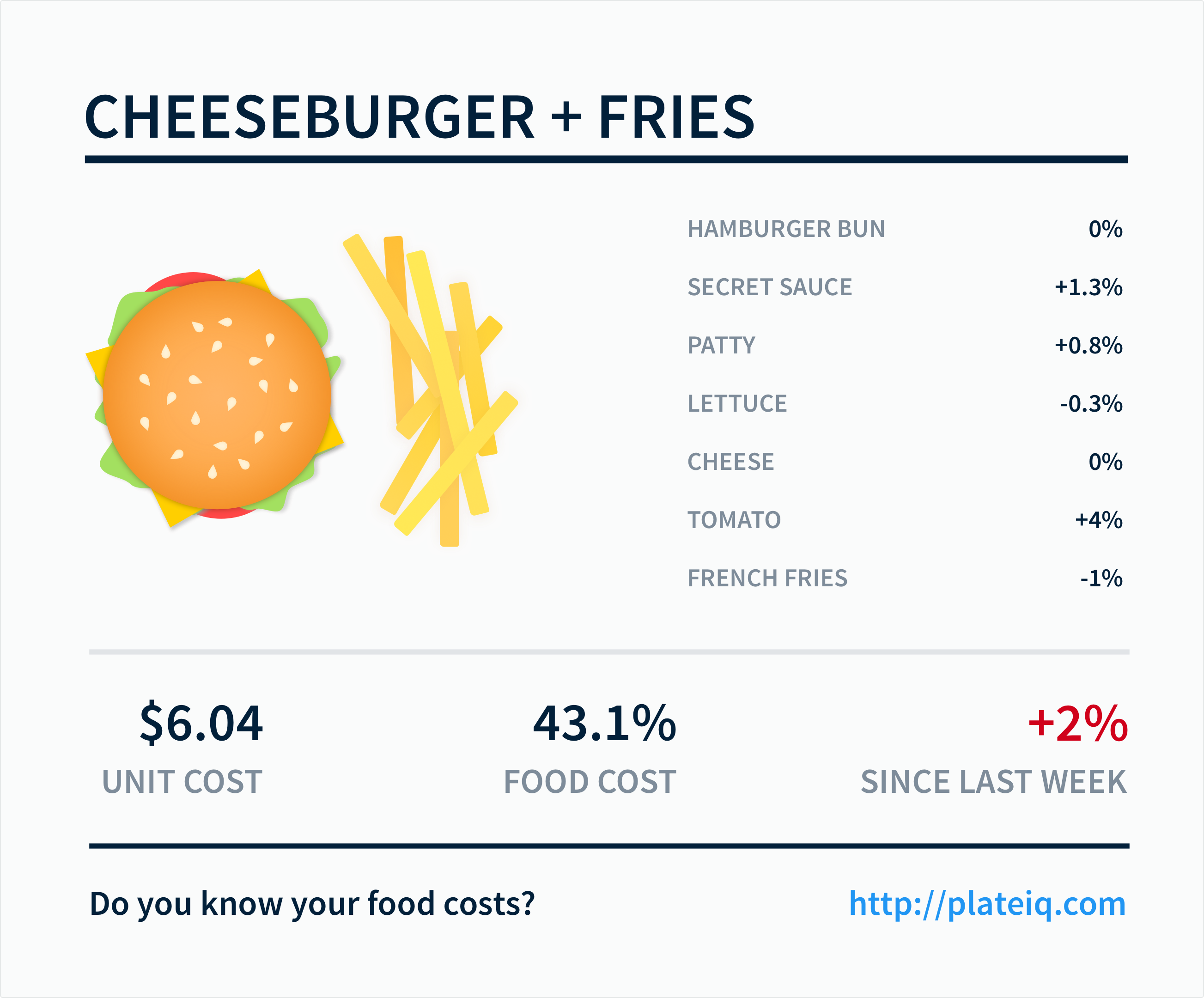
At one point I had an idea for visualizing the cost breakdown of menu items per ingredient (something our app did) and also recommended that Plate IQ partner with Priceonomics to do blog posts with its data. After I left, they did this. Check out this Forbes article, How Much Do the Ingredients Cost in Your Favorite Foods?.
Invoice Uploads
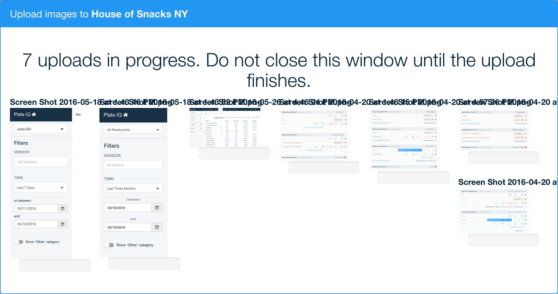
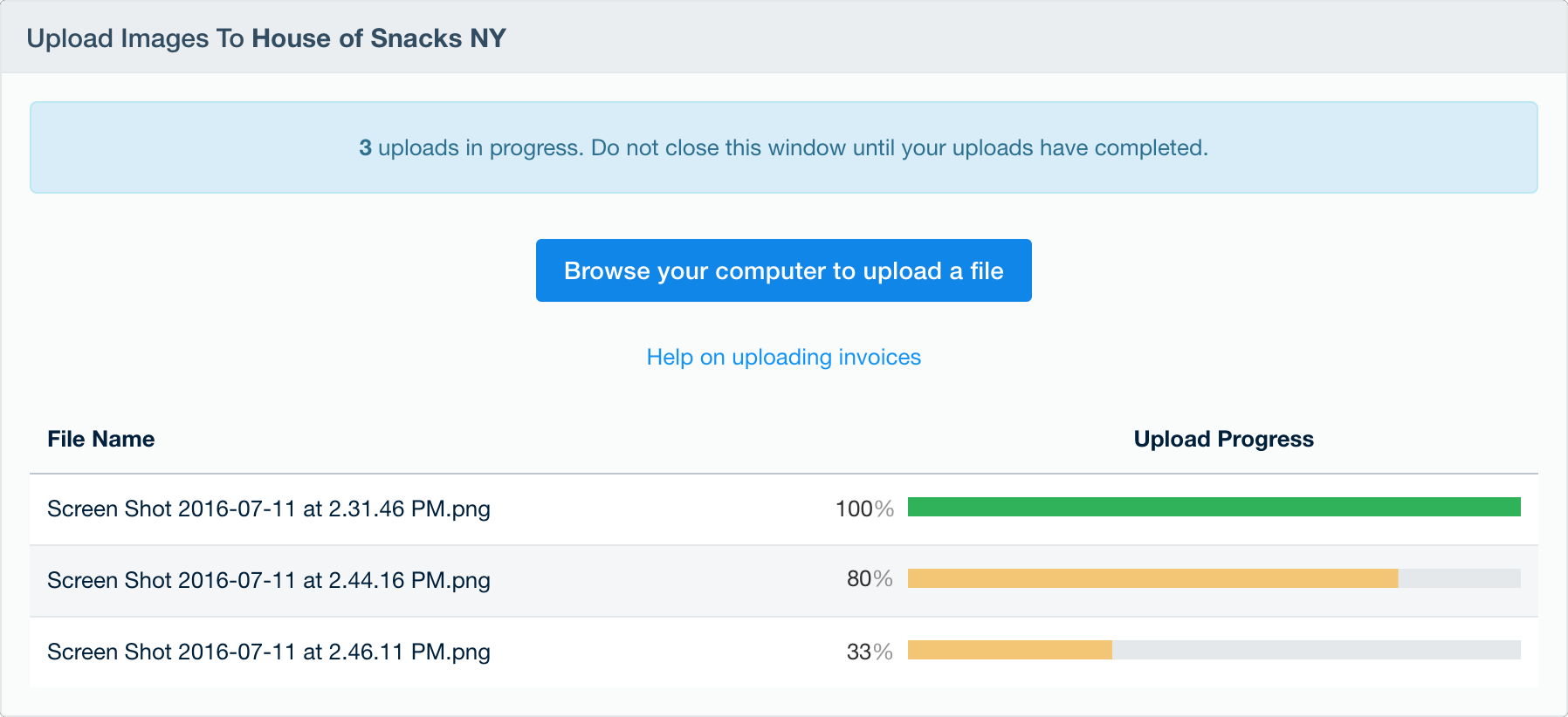
One way to send Plate IQ paper invoices was by scanning them and uploading them via our drag and drop interface in the browser.
However, users couldn’t see all the invoices they’d uploaded, or closed the window before uploads were complete.
I set out to improve this, but because it wasn't a critical bug, I didn't get to spend as much time on it as I would have liked.
Invoice Upload Modal: Before
Invoice Upload Modal: After
Fixing Bad Copy
At best, it made us look unprofessional; at worst, it made users confused and cluttered up the interface. Here are some examples of the bad copy I fixed:
Password Reset Flow
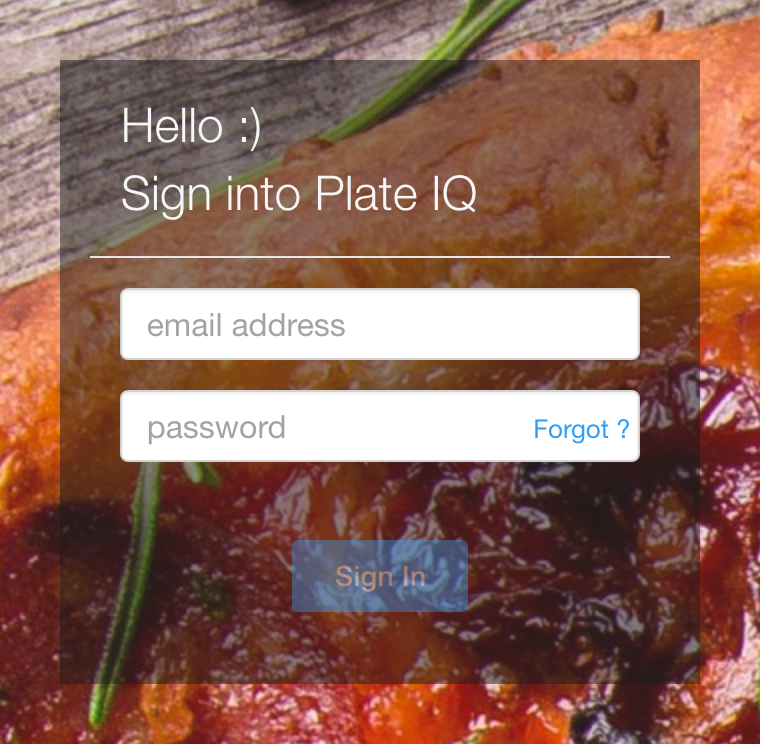
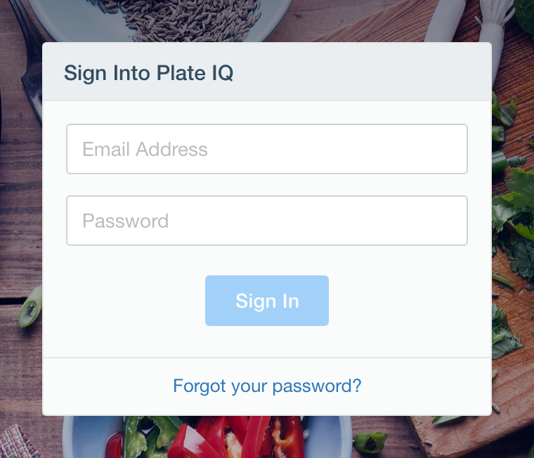
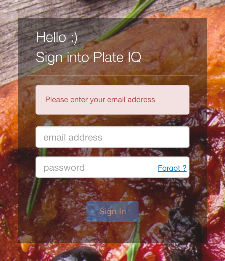
Customers would often ask our support team to reset their password. Since this shouldn’t have been a complicated workflow, I took a look at the existing UI.
It turned out, you first had to click "Forgot ?", then fill in an email address, then click "Forgot ?" for a second time to submit the form.
Login: Before
Login: After
Password Reset: Before
Password Reset: After
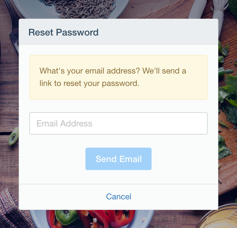
After the UI tweaks, we received almost zero reset password requests from customers. Hooray!
